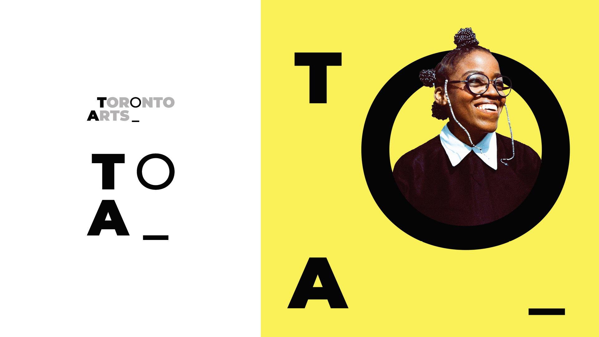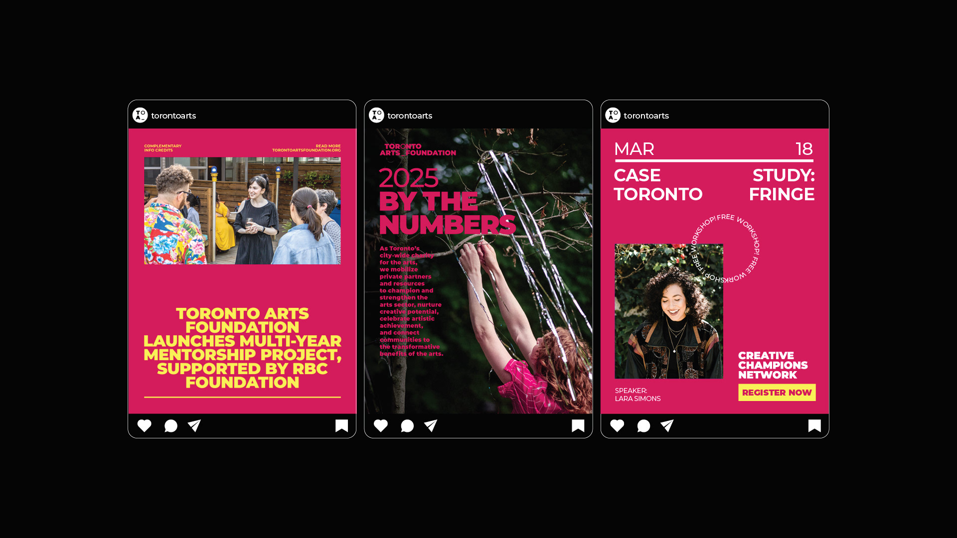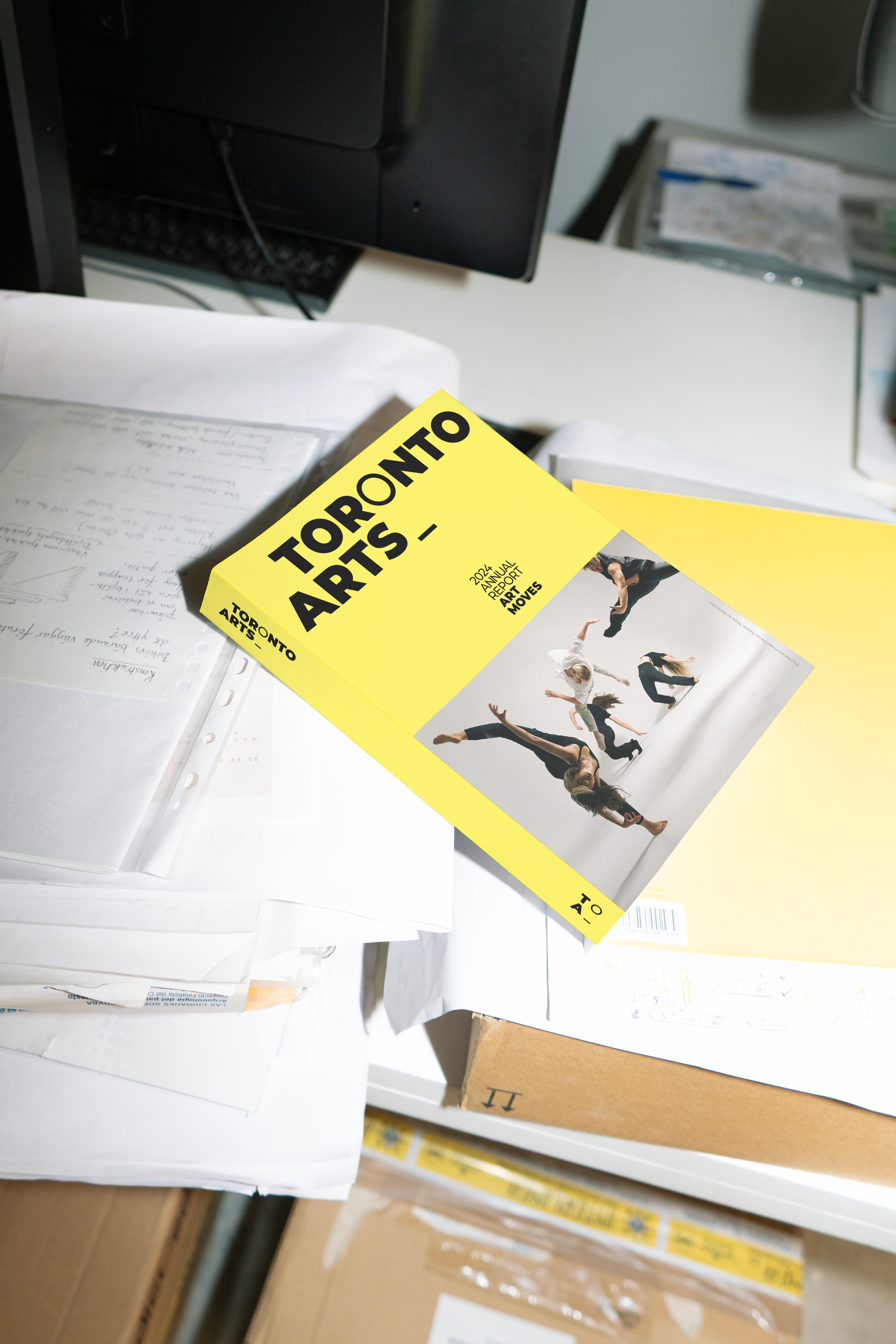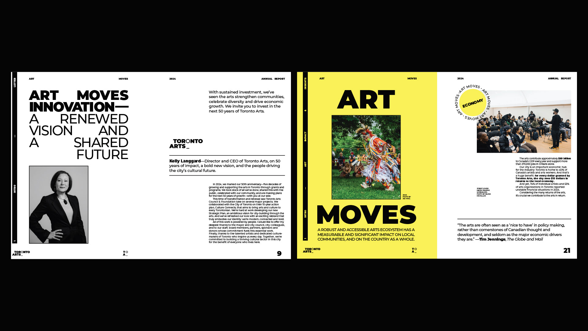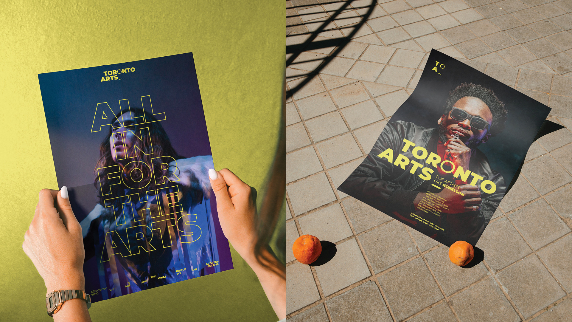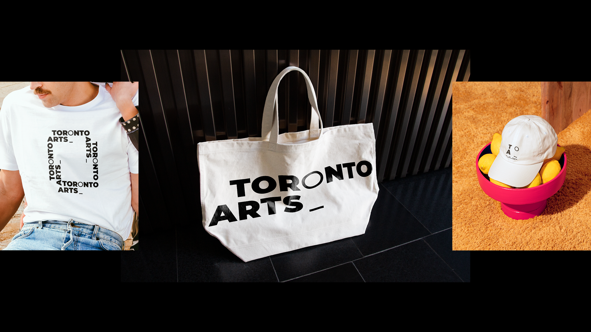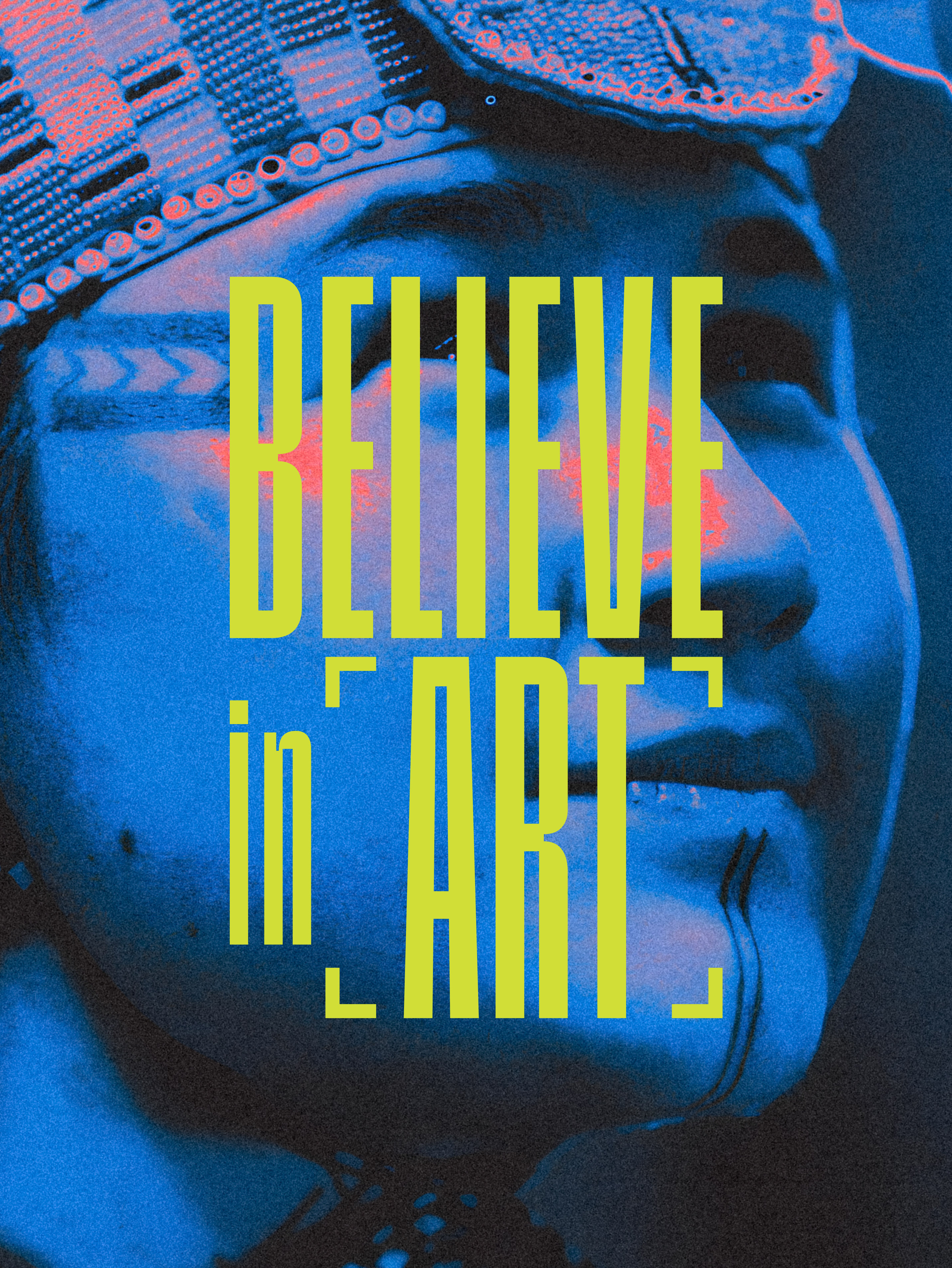
For the first time, Toronto Arts Council and Toronto Arts Foundation are making their complementary roles visible through one shared brand. The challenge was to create an umbrella identity that brings their diverse programs and initiatives together without losing the distinct voice of each. A flexible visual system connects every expression through shared some key visual elements, but strong enough to make each sub-brand stand on its own while remaining unmistakably Toronto Arts.
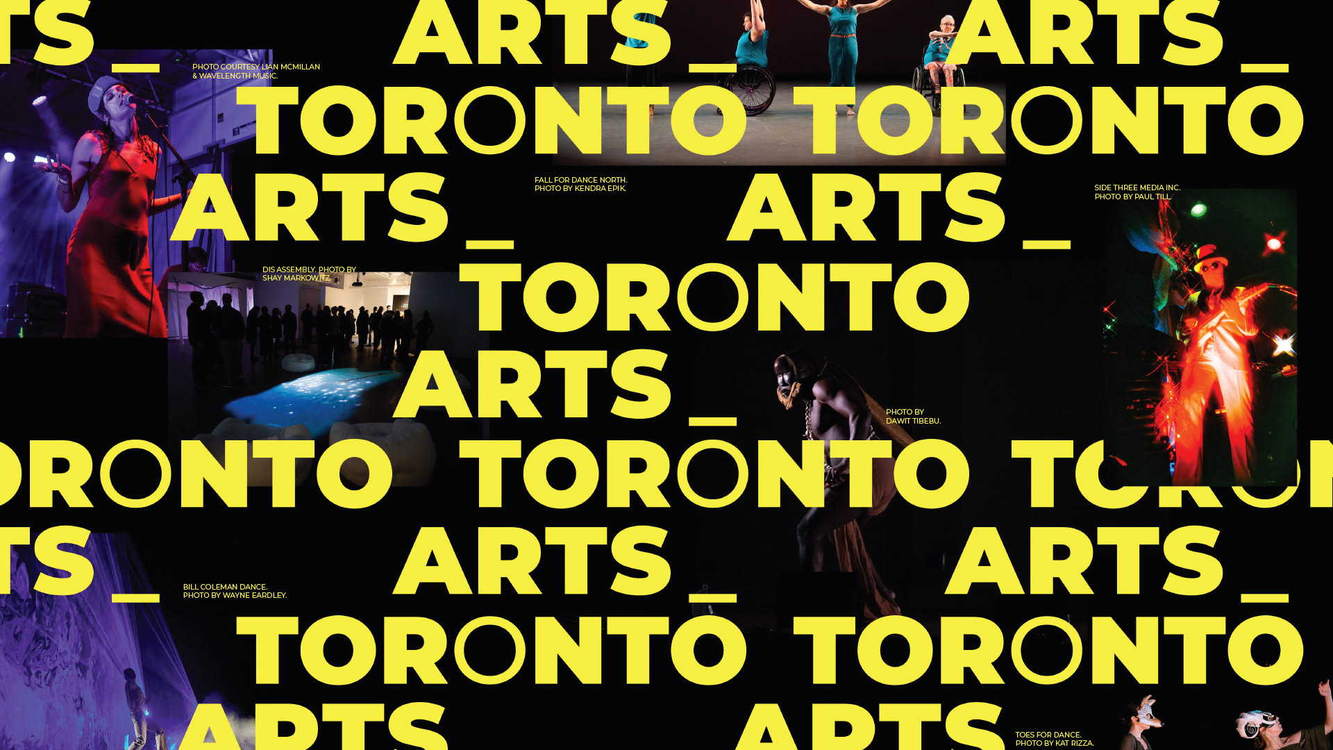

The Toronto Arts brand refresh is built around a bold, high-contrast typographic language, where the light “o” and signature underscore become symbols of possibility, continuity, and growth.